A Site Logo
By Jack Keys
I’ve never been that much of a visual designer. I dabbled a bit when I was in high school, mostly leaning towards photomanipulation, but it just never really stuck. However, I find myself in need of a few images to adorn this website, and I figure I’d rather sharpen a few of those skills. A site logo is the logical first visual element that I should have.
Practical Art Approach
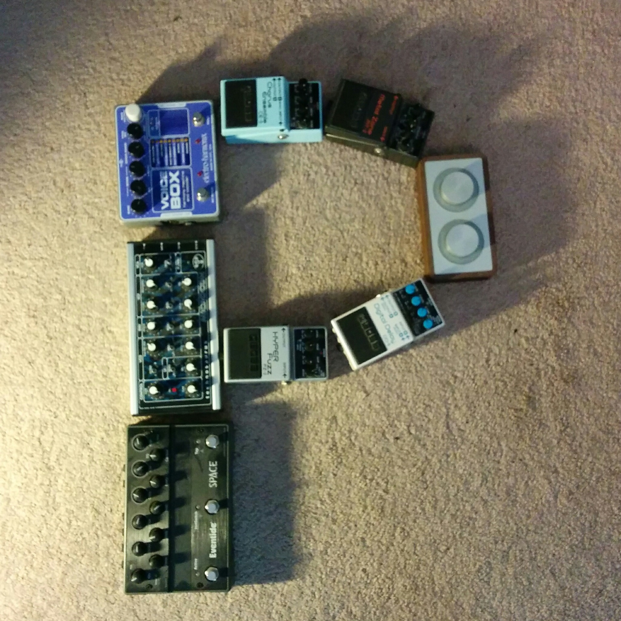
My initial thought was that I should try and design one by taking things that I use in my work and organizing them into a P for Paramnesia. Guitar pedals and boxy synthesizers were the most logical, which resulted in the following logo:

First attempt
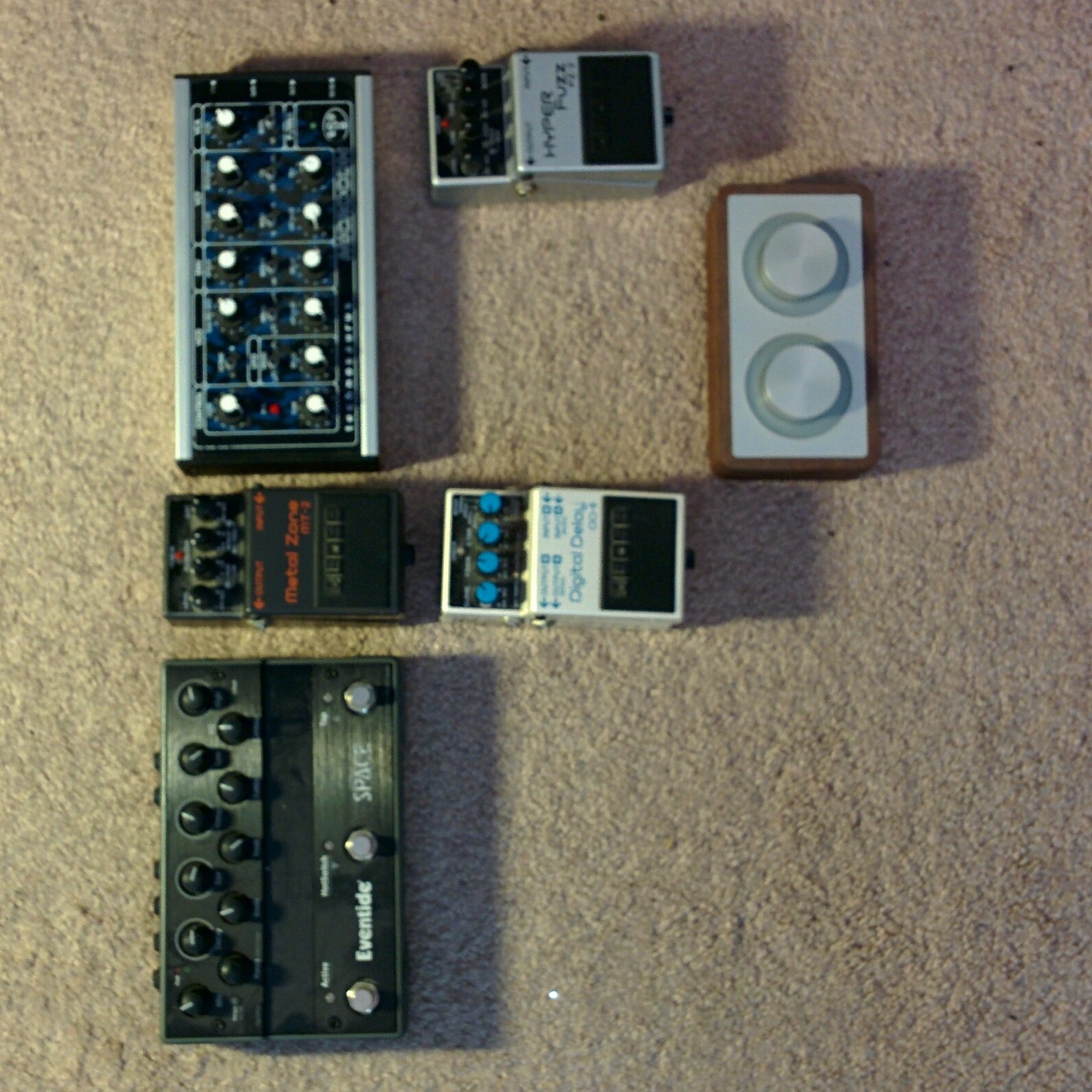
However, upon uploading this and testing it out, I found that it was ineffective when scaled down too much, such as when displayed as part of a tab in a desktop browser; there was too much going on, so at a small size, it was difficult to make out what exactly the image was of. I tried a more simplified version of the same thing, but found that it was still too difficult to distinguish at a smaller size.

Second attempt
Digital Art Approach
I still wanted to use a P for simplicity, and it was important that to me I incorporate elements that are more personal. I figured that, instead of trying to use actual equipment, then, I could use a representation of the work I’d produce with them. I opened up Tracktion and took a waveform from a song I’d been working on, threw it into GIMP, and starting playing around with colour levels, brightness, and contrast. I then threw a P on top, enclosed in braces for a little touch of my software engineer side, added a drop shadow, and found a font that I thought looked great when scaled down. I’m happy with the result; it’s simple, but meaningful.

The final result